Brand
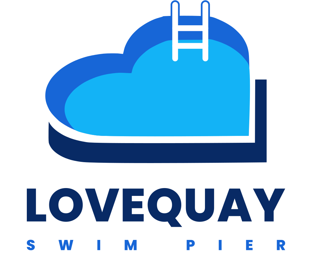
A heart-shaped pool with a ladder in it.
That's the whole idea. The basin wall behind, the water inside it, a swim ladder standing at the back edge, and the quay wrapping the near side.
The three silhouettes are true vector curves and the ladder is drawn as strokes, so every lockup, colourway and icon on this page comes from one set of geometry and stays identical at any size.

Anatomy
Four parts, one shape.
The pool
A heart, flattened and squared off at the near right corner, so it reads as something you look down into rather than a symbol on a card.
The water
Sitting inside the basin and set down and right, so the wall shows as a rim behind the back edge and closes up where the water meets the near side.
The ladder
Two rails and two rungs standing over the right-hand lobe. White in the water, backed in basin blue where it stands clear of it. The one thing that says swim.
The quay
A navy bracket around the near side and the right-hand end, held off the pool by a clear white gap. The bottom band reads deeper than the return because you look across it.
Lockups
Four ways to sign something.
Use the stacked lockup wherever there's room. Everything else exists because there isn't.
Stacked · primary
Stacked · reversed

Horizontal · wide spaces

Inline · navigation, under 40 px tall

Reversed over photography

Wordmark alone · rare
Colourways
Full colour first. One colour when you must.
Full colour

Two colour · embroidery, stamps

Navy · one colour

White · reversed
Clear space
Give it room.
Keep clear space around the logo equal to the height of the ladder on all four sides. Nothing else goes inside that boundary.
The mark stays legible down to about 24 px tall. Below that, use the favicon artwork, which crops square and thickens the ladder so it survives at 16 px.

48 px
32 px
16 px
Misuse
Please don't.
Don't stretch it
Don't recolour it
Don't tilt it
Don't put the colour mark on a busy photo
Palette
Lake, basin, coping, concrete.
Three blues from the mark, the navy of the quay, and a warm neutral taken from the concrete of the deck.
Signal Red is the red of the LOVE letters. It is reserved for safety warnings and hazard notices — never for decoration.
Typography
Poppins and Inter.
Poppins ExtraBold draws the wordmark and every heading. Inter carries the reading text. Both are open-licence and load from Google Fonts.
Know your limit
Before you swim
The water at the far end is deep and clean enough to go straight in from the wall. That is the whole appeal — and the whole risk.
Voice
Plain, warm, and never breezy about risk.
- Say the useful thing first. “Never swim alone” beats “safety is our top priority.”
- Don't sell the swim. Describe what's there and let people decide. No hype about bravery or cold plunges.
- Never imply supervision. There are no lifeguards, no inspections, and no owner. Any copy that softens that is wrong.
- Warm about the place, blunt about the water. The pier is loveable. The lake is indifferent.
Files
Take what you need.
SVG for anything on a screen or in print. PNG where SVG isn't accepted. All text is outlined, so nothing depends on a font being installed.
The whole set is regenerated from one script —
tools/build_brand.py — so the geometry can never drift between files.